NB: Please read the guideline carefully. Posters or artwork that does not comply with the brand guidelines below will not be accepted and events may be taken down.
We are committed to maintaining a consistent and recognisable brand identity across all event marketing materials. As a result, we have strict brand usage policies. Please read this post carefully if you intend using skybookings branding.
1. Important! Brand Name Usage
Please note that skybookings is a brand name and soon to be a registered trademark. Therefore, it is critical to use it strictly as stipulated below.
Wrong Usage
- Sky Bookings — no spaces allowed
- Skybookings — do not capitalise the first letter
- skybooking — don’t forget the “s” at the end
Correct Usage
There are only two ways to write skybookings. Either use with ALLCAPS (no spaces), or in all small letters (also no spaces). See the examples below.
- SKYBOOKINGS
- skybookings
3. skybookings vs skybookings.com
Another variation to bear in mind is the use of skybookings vs skybookings.com. All references to skybookings should be made to the company i.e. skybookings (pty) ltd. On the other hand, skybookings.com refers to the platform.
Therefore, your posters and artwork should in all likelihood refer to skybookings.com if you are selling tickets. On the other hand, press statements, letters and testimonials should refer to skybookings (the company).
2. Font & Typography
If you need to reproduce the logo, only use Monsterrat Extra Bold. Alternatively, please contact us for a higher resolution logo.
3. Brand Colors
The skybookings logo is strictly black or white.
4. Logo Usage
Please maintain a minimum clear space around the logo (padding), equivalent to the height of the “S” in “skybookings”. This ensures that no text, images, or other elements encroach upon the logo’s space. Avoid disproportionately scaling or stretching the logo to preserve its integrity.
5. Artwork Sizes (Desktop)
This is the wireframe (layout) of the events page on desktop (or large screens). Note that skybookings takes two types of artwork, banner and poster.
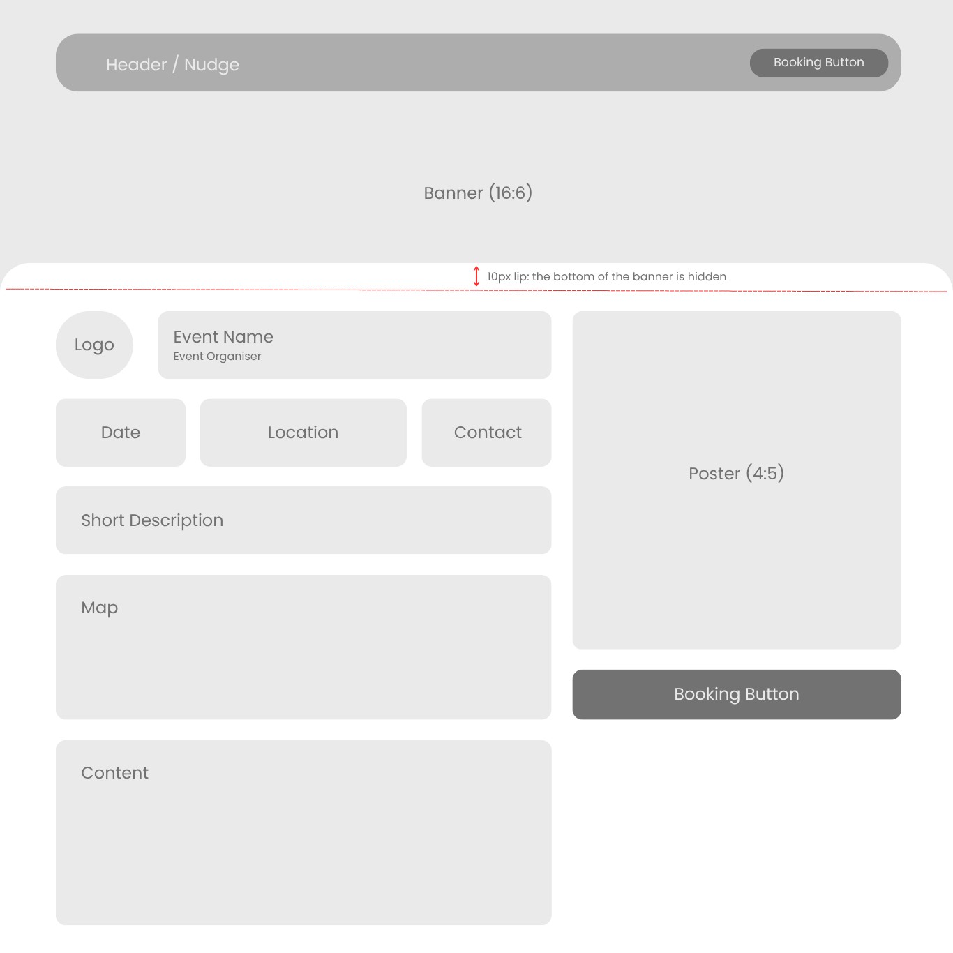
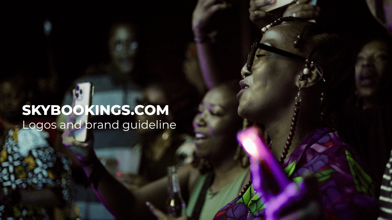
Banner (16:6): The banner only appears on large screens e.g. laptop or desktop. This image is cropped to 16:6 pixels. So, where the width is 1980px, the height will be 743px. It is recommended to upload a good quality image that communicates the spirit of your event, but without too much text or information on it.
Poster (4:5): The artwork appears on all screen sizes. Similarly, the artwork is cropped automatically to a dimension of 4:5. So, where the width is 1080px, the height will be 1350px.
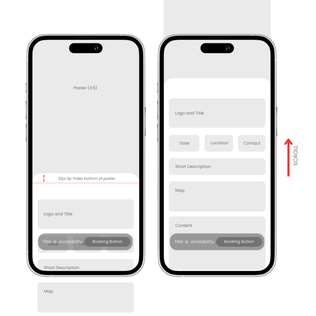
10px Lip: For both types of artwork, please bear in mind that the bottom 10px will be hidden behind the lip. This gives the event that the artwork is scrolling behind the content panel.
6. Mobile Layout
The mobile view draws on the desktop view with a few critical differences. The image on the left shows the landing position without scrolling. Notice that the booking button is overlayed at the bottom of the screen, and fixed during scroll.